
 Trends come and go, and vintage style is making a comeback when it comes to styling homes! Deemed “modern color styling” when originally published in 1935, an archived Lowes Brothers Paints and Varnishes article highlights many style points that are growing in popularity in today’s homes and color schemes.
The original article describes modern color styling as implementing and using colors that are in accordance with the current accepted trends. Often confused with contemporary trends, today’s modern style is based on a design movement that progressed around the turn of the 20th century.
Modern style décor and furnishings celebrate natural materials, neutral or earthy tones, and the elimination of unnecessary items and details. The archived article suggests using color for a definite purpose, whether in clothing ensembles or color schemes inside and outside the home.
The purpose of color when it comes to home styling is the same as the function of color in styling an outfit but, according to the article, the use of color is truly more important than the choice of colors. Exteriorly, certain color schemes are associated with specific design elements while walls and paint choices can entirely change a room without adjusting much, if any, of the furniture.
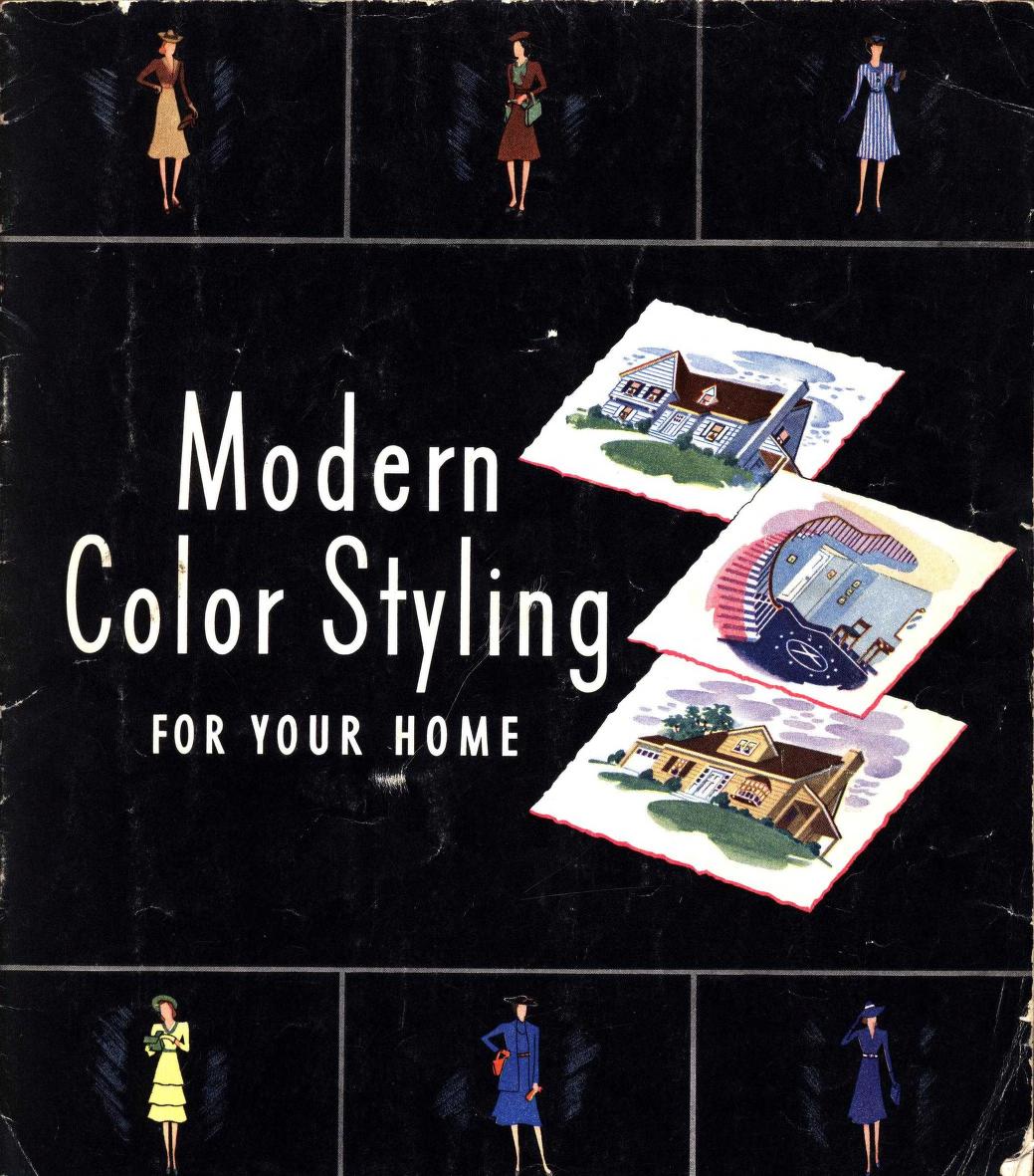
- Paint small houses in a lighter hue to increase the apparent size and paint the entire body in the same color.
- Blend two different construction materials by painting them the same color – painted brick, anyone?
- Use bright color touches only on small houses.
- Use one color, or at least gradients of one color for body, trim and window sashes on a stately house.
- Paint upper-level shutters a contrasting color of shutters on the lower level, like the overall body color. Vivid colors on the shutters can overpower the home’s body color.
- Concentrate color interest in small areas, such as shutters, window sashes and the door.
- Simplify decorative or outdated trim by painting it in the body color.
When it comes to internal décor, imagine the walls as the base of the room’s color scheme beginning with either wall color or window treatments, then build the room out from there with a cohesive color scheme and complementary elements.
- For small rooms, paint walls a light color to increase apparent size. Dark colors have the power to shrink a room’s appearance.
- If the room has a high ceiling, paint it darker than the walls, and widen the effect of the windows by looping up the draperies or placing the rod closer to the ceiling and trim. By painting the ceiling dark, the horizontal is emphasized.
- To make woodwork inconspicuous, paint it the same color as the walls. Strong colors on the woodwork, bring it to the foreground.
- For additional accentuation, paint the ceiling and one accent wall alike, with three walls in another soft, agreeing color or shade. Avoid using strong contrasting colors in combination.
- Be conscious of using bold, bright colors on walls. In general, walls should be considered as a background element to décor and remain less intense than the furnishings.
- Avoid cluttered patterns and flowered or figured draperies. Simply use plain walls. In contrast, use simpler, solid draperies with multi-colored walls.
- Reserve vivid colors for small decorative touches or art objects. Too much strong color destroys the color balance.
Whether in fashion or design, trends come and go, oftentimes making a comeback in one form or another. Check out the full Lowes Brothers Paints and Varnishes article of comeback trends and styles here.